Slanted Buttons with 3 Lines of CSS
Karen Menezes on June 18, 2014Two weeks ago, a designer sent in an app landing-page mockup with slanted buttons. He also sent me a codepen link to mimic them using pure CSS. The codepen snippet took advantage of generated content (:before and :after) to insert pseudo elements in the DOM using borders with some transparent sides. This can get a bit messy and brittle, and is a hack with too much code for this use case.
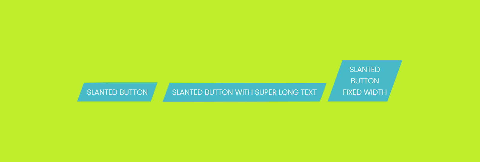
I attempted to do this the most natural way, i.e. using CSS transforms via skew. I skewed the button selector and it worked beautifully, except that it skewed the text as well.

So I wrapped the text inside the button in a span and then reversed the skew.
.button-slanted {
  transform: skewX(-20deg);
}

.button-slanted-text {
  transform: skewX(20deg);
}
Unfortunately, this didn't work.
I racked my brains for a while, and finally added a display: inline-block to the span. This got it to respect the transforms applied on the span rather than simply inheriting the styles applied to the parent. I then tested on Firefox and Chrome and it worked perfectly. Note that IE doesn't need the span to be declared as inline-block or block and works fine without it.
So we can conclude that except for IE, browsers currently don't apply CSS transforms on inline elements.
Here's the final code, minus the vendor prefixes for IE9 and all webkit browsers (Chrome 36 will however support the unprefixed standard syntax). The CodePen demo below it, however, contains the vendor prefixes.
.button-slanted {
  transform: skewX(-20deg);
}

.button-slanted-text {
  transform: skewX(20deg);
  display: inline-block;
}
Here's the CodePen demo
See the Pen Slanted Buttons with Pure CSS by Karen Menezes (@imohkay) on CodePen.
Credits
Image by Karen Menezes